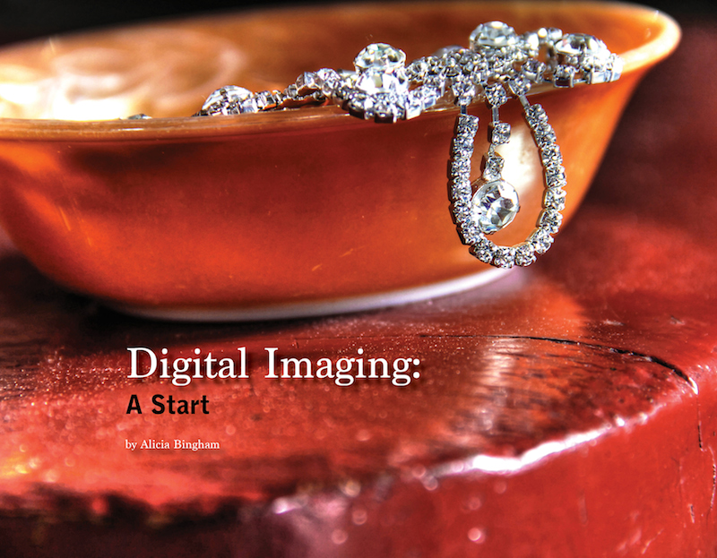
Here is my final photo book spread. I spent a lot of time trying to choose the right pictures for the book, as well as choosing which images I wanted to put in what order. I decided on what I thought were my best photos, and went from there. I paid the extra money to have a full bleed cover because I thought it would look better, and I really like how it turned out. It’s a beautiful image edited as an HDR using Photomatix and Photoshop.
As for the design, I went with simple rather than anything too fancy. I had some dark images, so that’s why I chose to go with the darker theme, in order to let the images fade off into the black background better. However, I didn’t want it to be too dark, so I added the white borders on some images. Choosing fonts was a difficult thing for me, but eventually I found two that I liked, that I thought worked well together.
If you’re interested in seeing the whole thing, click the image to see a PDF of my photo book, or click the link below to see it. Enjoy!